Why We Took the Database Out of a Convocation Website
The 1st Combined Southern Africa Holy Convocation needed a website attendees could rely on for three days at Ellis Park Arena. We first built it with a database and an admin panel, then took both out. Here is why the simpler site was the better one.
An event website has an unusual shape. For months it is visited now and then, by people checking a date. Then, in the week before and the days of the event itself, it becomes the one place attendees go to find out where to be, when, and what to bring — usually on a phone, often on mobile data, sometimes while already on the road.
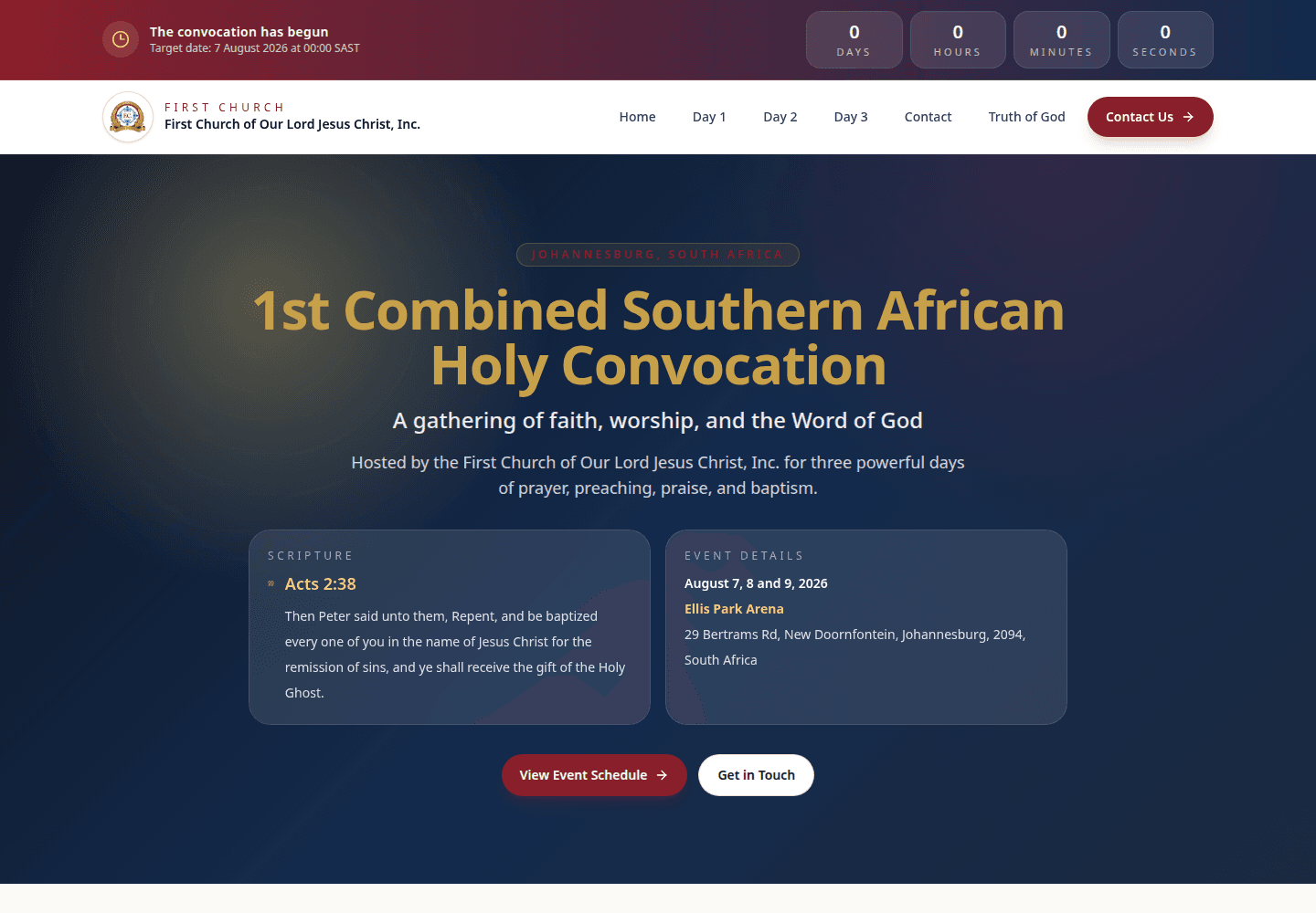
That was the job for the 1st Combined Southern Africa Holy Convocation, hosted by the First Church of Our Lord Jesus Christ, Inc. at Ellis Park Arena in Johannesburg from 7 to 9 August 2026. Saints were travelling from near and far. They needed the schedule, the venue, somewhere to stay and the details of the gatherings around the services — and they needed the site to be there, and fast, whenever they looked.
Starting from the questions attendees ask
We planned the site around what someone attending actually wants to know, rather than around a list of pages:
- When? Three services — Friday at 5:00 PM, Saturday at 4:00 PM and Sunday at 11:00 AM — each with its own page covering start time, doors, venue and admission.
- Where? The arena's address, a map, and one-tap directions.
- Where do I stay? An accommodation flyer with direct Booking.com links to hotels near the venue.
- What else is happening? A Meet & Greet luncheon on the Thursday before, an Africa Day celebration on the Saturday, and baptism at the services, with a note to bring two towels and a change of clothes.
The homepage answers all of that on one scrolling page, with a live countdown at the very top. Everything else is one tap away.
The first version had everything
We built the first version in May the way we build many client sites: Next.js with a PostgreSQL database behind it, and a role-based admin area. Organisers could manage the countdown, the site settings and the page content. There was an audit log, an inbox for contact-form messages and an export for submissions.
It worked. But when we audited it for production, the list of remaining work was long: rate limiting, account lockout and a stricter password policy, a storage plan for uploads, database backups, admin credential rotation, error tracking and automated tests for permissions. None of that is optional for a site with a login on the public internet. And almost none of it had anything to do with helping someone get to Ellis Park Arena on time.
The judgement call: what does an event site need to survive?
We asked a blunt question. Over the three days that matter, what is most likely to go wrong? The honest answer was not "an organiser cannot edit a paragraph". It was a busy server, a database connection problem, or an admin account that had not been locked down. Every moving part we had added was one more thing that could fail at the worst possible moment.
The content, meanwhile, was small and rarely changed: three days, one venue, a handful of flyers and a list of FAQs. It did not need a database. So in June, we took the database out.
The rebuilt site kept the same design but moved its content into plain TypeScript data files that live alongside the code. It is deployed to Cloudflare Pages, which serves it from Cloudflare's global edge network rather than from one server. The contact form posts to Pageclip, a hosted form service, so there is no inbox of our own to secure. The admin screens survived only as a read-only preview.
The trade-off is real. Changing a detail now means editing a file and redeploying, instead of logging in. For an event whose arrangements were settled weeks ahead, and where we were making the updates anyway, that was a small price. In return the site has no server to fall over, no database to back up and no login for anyone to attack.
Built for the phone in someone's hand
People check event details on their phones, so much of the later work went into mobile details that are easy to overlook:
- The menu closes itself after a tap, so nobody is left staring at navigation on top of the page they chose.
- Flyers enlarge in the same tab instead of opening a new one. On a phone, a new tab is an easy way to lose someone.
- The schedule badges wrap cleanly on narrow screens instead of breaking the cards.
- The site can be added to a home screen with the church's logo as its icon, so it opens like an app during the event.
- The countdown runs to the second in South African time, then changes to say the convocation has begun.
The flyers themselves are part of the design rather than attachments. The Africa Day and Meet & Greet flyers sit in the page where each gathering is explained — the luncheon's right beside its time, address and a directions button — so the image and the practical detail arrive together.
A site that points beyond the three days
Most event sites become dead ends the week after the event. We did not want someone arriving curious in September to find nothing to do. So alongside the convocation details, the site introduces the church's leadership and shows its temples in Johannesburg and Cape Town, with addresses, Sunday service times and directions. A visitor who finds the site long after August still finds somewhere to go.
What we would tell anyone planning an event site
Build for the days that matter, not for the months in between. Work out what an attendee needs in the moment — the time, the place, the way there — and make that the fastest thing on the page. And be wary of features that make a site easier to manage but harder to keep running. Sometimes the most reliable thing you can build is the simpler one.
The site is live at togafrica.org, and there is more of it in our portfolio. If you have an event coming up and need a website people can rely on when it counts, talk to us.
Enjoyed this article?
Get more design tips and web dev insights in your inbox. No spam — just good content.