Designing a Law Firm Logo Without Falling Back on the Clichés
Motatinyane Attorneys wanted a logo that is unmistakably a law firm, and unmistakably theirs. Here is how we kept the scales and the shield, turned them into one shape, and built a burgundy identity around a custom MA monogram.
Most law firm logos are assembled from the same four parts: a set of scales, a shield or a column, a heavy serif typeface, and a palette of navy, black or gold. There is a good reason for that. People choosing a lawyer are looking for signals of seriousness, and those parts send them. The trouble is that when every firm sends the same signal, none of them is remembered.
That was the brief from Motatinyane Attorneys: a logo that is unmistakably a law firm, and unmistakably this law firm.
Starting with what the category already says
Before sketching anything, we studied how other law firms present themselves. The recurring elements were easy to list — scales of justice, shields, classical columns, formal serif lettering — and so was the pattern that makes so many of them forgettable: several symbols competing inside one mark, and colour chosen because it is safe rather than because it means anything.
That research did not tell us to throw the symbolism away. It told us which parts carry meaning and which are just habit. Scales say fairness. A shield says protection. Both are things a client genuinely wants from an attorney. What we needed to avoid was using them the way everyone else does.
A colour the client chose, and why it works
Burgundy came from the client, and it was the right call. It has the weight and authority people expect from a legal practice, but it is rare in a field dominated by dark blue and black-and-gold. A burgundy mark on a letterhead, a document cover or a sign outside an office reads as a law firm at a glance, and as a different law firm a moment later.
We paired it with a neutral grey. The grey is not decoration. It gives the identity a quieter second colour for fine lines and supporting text, and a complete single-colour version for the places where burgundy is not available or not appropriate.
Two symbols, one silhouette
The early explorations tried the obvious arrangements of shield, scales and initials. Some leaned too heavily on tradition and could have belonged to any firm from any decade. Others were cleaner but lost the professional weight the brief asked for.
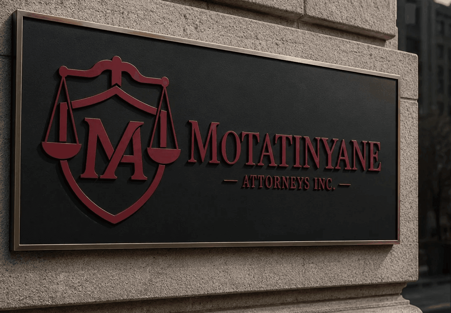
The direction that worked stopped treating the scales and the shield as two separate objects. In the final mark, the beam of the scales runs across the top of the shield and the two pans hang either side of it. It reads as one shape, and that matters more than it sounds: a single silhouette stays recognisable when the logo is printed small on a business card or shown as a profile picture, where two stacked symbols tend to collapse into a smudge.
Making the initials the part people remember
Symbols tell you what a business is. Initials tell you who it is. Inside the shield sits a custom "MA" monogram in which the two letters are merged into a single form, rather than typed side by side.
Getting that to feel natural took the most iteration. A forced monogram — letters bent out of proportion so that they meet — looks clever for a second and awkward afterwards. We refined the shared strokes, the weight of each letter and the space around them inside the shield until the pair felt balanced, legible and symmetrical, so that it works as an icon on its own as well as part of the full logo.
The wordmark is set in Instrument Serif. It has the formality a legal practice needs without the heaviness of a traditional book face, and its fine contrast sits comfortably beneath the solid monogram above it.
The judgement call: fewer details, not more
With symbolism like this there is always a pull towards adding more — more detail in the scales, more ornament around the shield, a column or a laurel for good measure. Extra detail can look impressive on a large screen in a presentation.
We went the other way, and removed anything that did not carry meaning. A law firm's logo spends most of its life small: in an email signature, in the header of a PDF, on a stamped document, or photocopied in black and white. Every unnecessary detail is something that will fill in or disappear in exactly those places. Simplifying the forms and tightening the symmetry is what lets the mark survive a poor printer and still look deliberate.
It was also what the client responded to most. The feedback singled out two things: how distinctive the monogram is, and how simple the overall system feels.
A system, not a single file
A logo is only useful if it fits the places it has to go, so the delivery was a complete set rather than one image:
- Three colourways — burgundy, burgundy with grey, and grey.
- Four layouts for each — a vertical version with the firm's name, a horizontal version, the mark on its own, and the name on its own.
- Four file formats — SVG for scaling and editing, print-ready PDF, transparent PNG for digital use, and JPG for everyday use.
The layouts each solve a practical problem. The horizontal version fits a letterhead or a website header. The vertical one suits signage and square social profiles. The mark alone works as an icon, and the name alone covers the places where the symbol would be too small to read. We also showed the identity in context, including on exterior signage, so the firm could judge it where people will actually see it rather than on a blank white page.
Why this matters for a small practice
For an independent firm, the logo is often the first part of the practice a potential client sees — before the website, and long before a consultation. It has to say established, trustworthy, careful before anyone has spoken to an attorney. Motatinyane Attorneys now has an identity that says those things in its own voice, and a set of files that will keep saying it consistently wherever the firm appears.
You can see the full identity in our portfolio. If your business needs a logo that clearly belongs in its industry without looking like everyone else in it, get in touch — we are always happy to talk through what you have in mind.
Enjoyed this article?
Get more design tips and web dev insights in your inbox. No spam — just good content.